It is WIP. Because the world is always on.
Scale of your project? Painpoints? User feedback? Available budget? Resources? Uncomfortable deadlines? Well, it all depends. The UX process that we will adopt for your next big thing will depend upon various factors and situations. And yes, it will be revisited and evolved over time. However, with my experience, following are the techniques I use at the core:
Analysis
1 Competitive Analysis
Starbucks and Dunkin' Donuts are direct competitors, while the prepared foods section of the local super market could be an indirect competitor to both of them - especially if its coffee is good.
- Prioritize key competitors and emerging competitors
- Understand strenghts and weaknesses of the competitors
- Find out key brand differentiators
- Review economic environment (what's your users' purchasing power?)
2 Mental Model
Having a solid, data-driven 'I-didn't-make-it-up' roadmap is inevitable for making design choices.

- Understand users deeply
- So deeply that you could live their lives, walk in their shoes and make decisions exactly like they would
3 Task Analysis
Identify user's thought process and desired reactions towards a particular taskflow segment.

4 Red Route Analysis
Consider all the critical and frequent user activities (read goals) on your app. Give these activities all the importance needed and earn healthy bread and butter!
 Defining crisp red routes for your users is like allowing them to travel from Point A to Point B without any obstacles.
5 Storyboards

- Storyboarding is about visually depicting problems, solutions and benefits.
- Very handy while explaining a scenario to stakeholders or while discussing about a problem solving feature.
- It should capture user's fears, motivations and reactions within a context.
Design
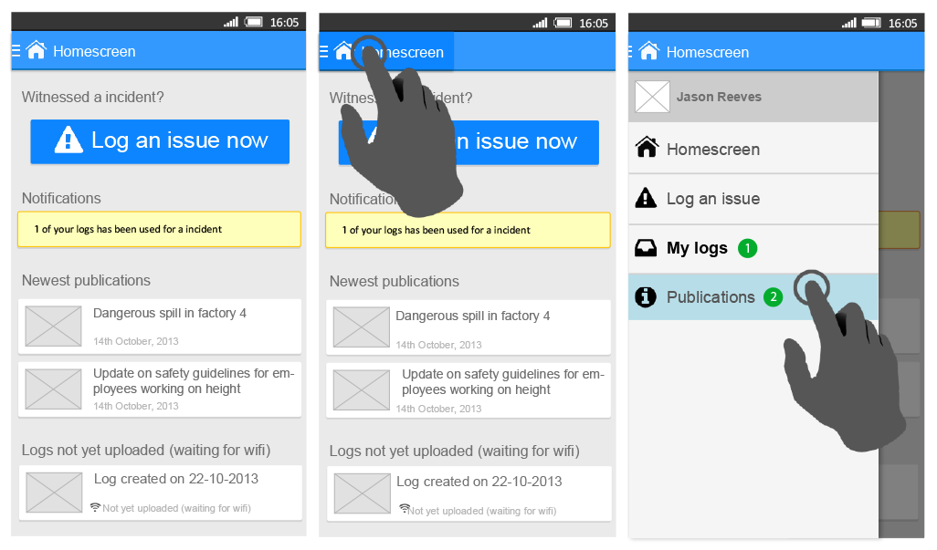
6 Wireframes
This is exactly where your users / team-mates start getting sense of UX and hence, spotting potential usability problems at this early stage of design phase becomes easy! Iterate sooner and painlessly.
- Rough guide for the layout.
- Put abstract concepts into sketch-like form.
- Give your concept a face to visually communicate with users and team-mates to generate feedback.

7 Rapid Prototyping
Basically, print wireframes on paper, start usability testing in front of a user guiding her through the process. Discover usability issues and validate design decisions based on actual user reactions. It is an inexpensive process.

- Give users an open-ended task.
- Ask them what they expect to happen with a particular interaction.
- Try to analyse if the interface is being used as expected.
8 High Fidelity Mockups
After successful iterations of wireframing, the design reaches the point of high fidelity. This is a phase to apply Product Branding, Grid Structure, Typography, Iconography, Color Scheme etc.

9 Interactive Prototypes
Use mockup screens to quickly develop interactive prototypes. I use InVision app for this. It allows you to do this in a very collaborative way.
This lets the team and the clients easily observe exactly how well the product will be received before the product gets built.


